
There was extra effort to create this kind of report in PowerBI, back in April I published an article to implement different formats in the same column.
http://hectorv.com/table-or-matrix-for-side-by-side-column-comparison-with-columns-with-different-formats-in-the-same-column
Now, tt is extremely easy to have same result with no need of DAX measures to workaround different values, formats and alignment in a column.
You can download this Power BI desktop file with this link:
https://1drv.ms/u/s!AjlEiXFjD5fu2Sh0BaL-OPep9-Pe
There are many cases where we need to use a table or a matrix and we need to specify different formats in the same column. Showing the format with the numeric values makes the report easier to read than a simple number with no units.
In the case of this financial report below, we can see three different formats in the same column:
Currency ($), Currency and Thousand ($K), and Percent (%).

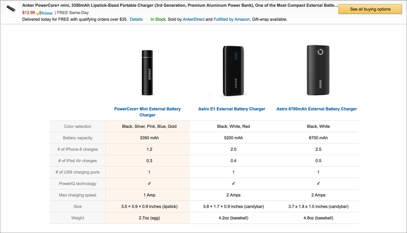
Another example is a side by side comparison of products. In the case below, we have different formats like: text, mAh, decimal number, Whole number and Amp formats, all of them in the same column.
I’ll show you this solution based on financial sample data downloaded from:
This spreadsheet will be imported using Power BI desktop and you have to choose the worksheet: financial. Notice that this solution works for both: Power BI imported mode and live connection mode to SSAS Tabular. In the case of SSAS Tabular, you would have to import the excel spreadsheet in the Visual Studio Project.
I created a flag URL for the image, which is not part of the objective for this article. Even though, I’ll show you the calculated column formula created in the Financial Table:
Flag = "https://image.ibb.co/" & SWITCH([Country],"France","d4vwba/fr.png","Mexico","h8uHhF/mx.png","Germany","nGmV2F/de.png","Canada","dsjuUv/ca.png","United States of America","c023NF/us.png")
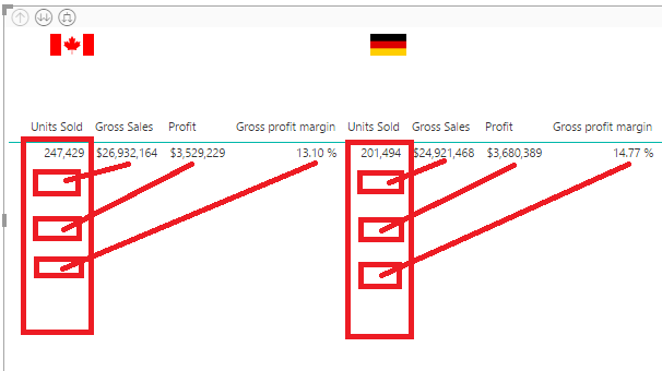
The following table was easy to create. Each country has a row and we can do a row by row comparison.

Even though is not what we are looking for. We are trying to get a side by side column comparison. We can create a matrix as shown below.

This is the Matrix Report version, after changing the flag and Country fields to the Column section in the Matrix. All fields under the configured Values section are shown as multiple columns.
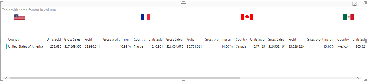
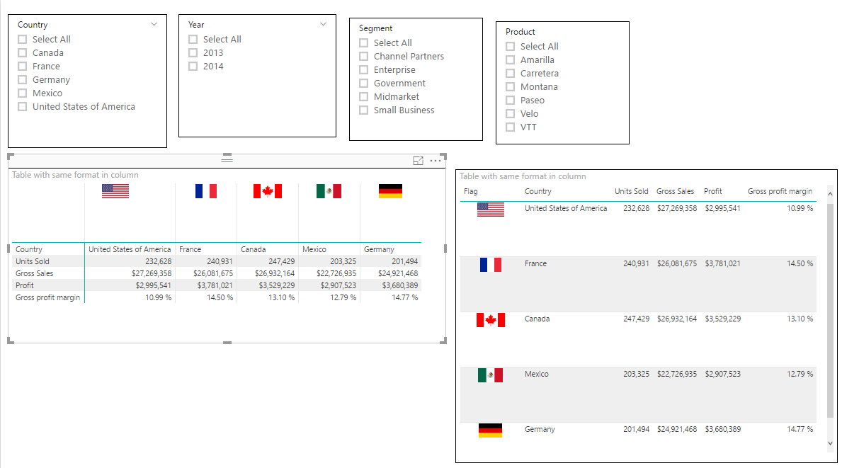
What I really want is only one column per country and also the columns header in the left side of the table as the very first column.
The Solution
In the formatting options under Values go and turn on the new formatting option: “Show in rows”.
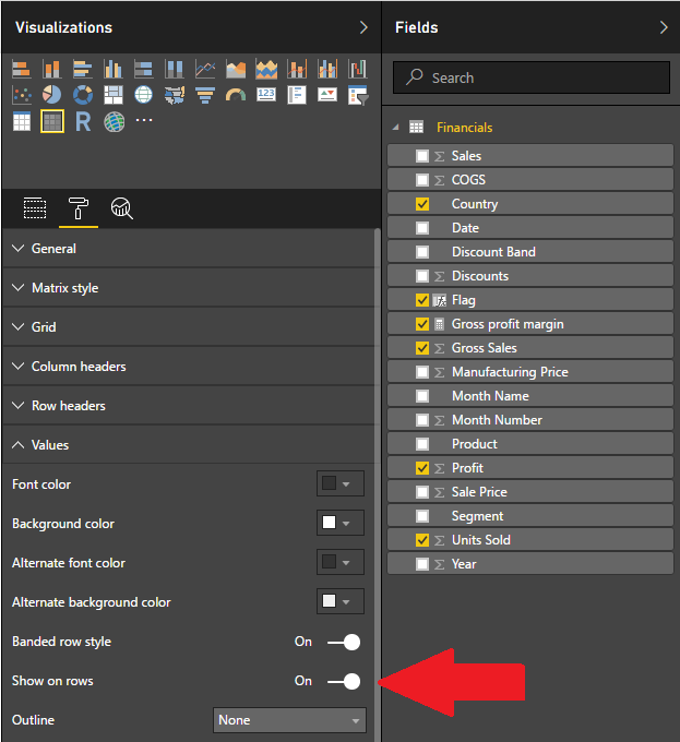
This will show the table well align and with different formats under the same column.

We add some slicers and we have both versions side by side matrix and simple table.
There are some cases where the side by side comparison in column and the formatted values are much easier to read than table with rows by row comparison. Especially, when there are multiple items or rows, it is easier for the end-user to compare columns side by side, where you can scroll up and down rather than scroll the table horizontally in a row by row comparison.
You can download this Power BI desktop file with this link: